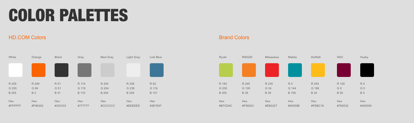
Branding:
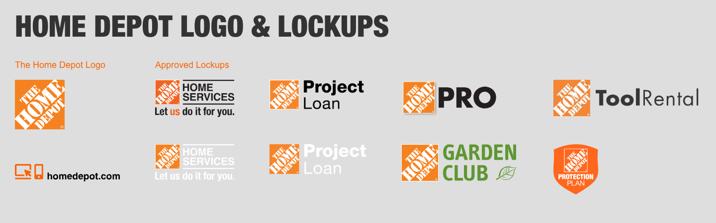
Bright orange (f96302) is our most famous brand marker along with our white stenciled logo font in our badge. But branding can be a companies philosophy, products, an overall price point and often a feeling. Having spent 8 years on the front lines of one of the worlds largest Big Box eCommerce sites I have become innately familiar with the branding at The Home Depot. If I had to sum it up in one word - it would be “authentic”. We are a company for the average person who doesn’t mind getting a little dirty doing their chores. Our photography should never be the city slick images some of our competitors use in their Marketing. Instead, we opt for “doing” shots of everyday people working around their homes with a little saw dust and soil warming the image. The style of our web pages are also part of our branding, teaching the customer what to expect and how to find their way around our virtual store.

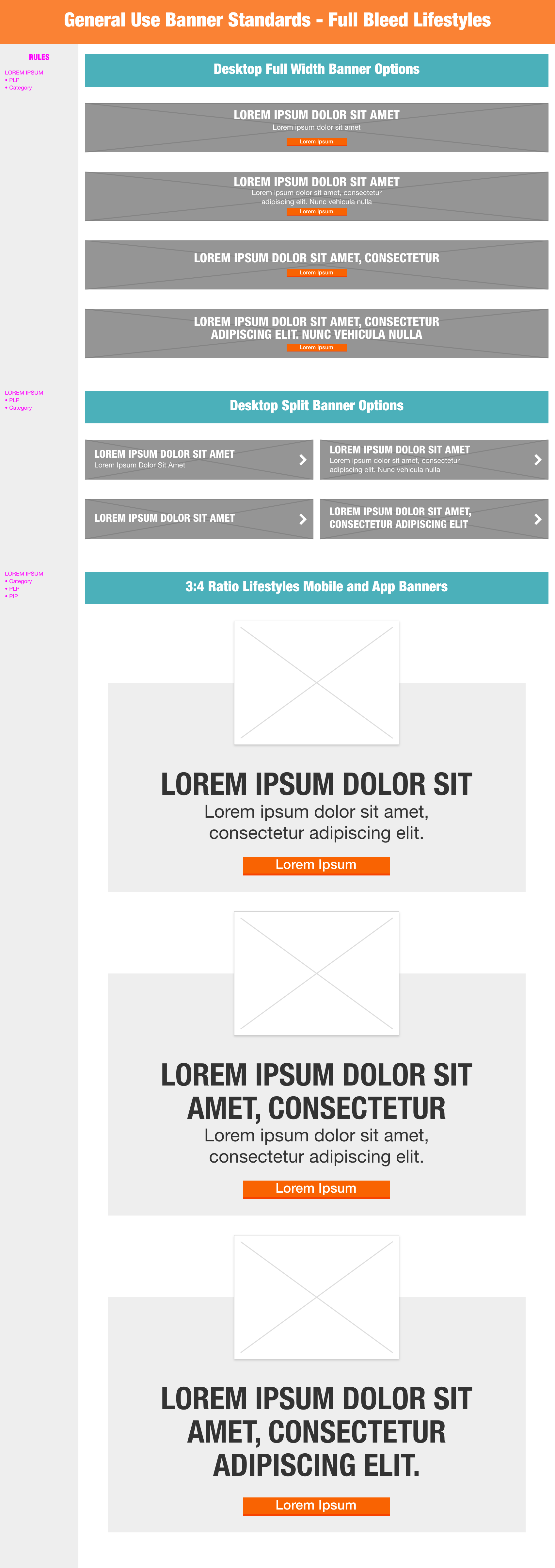
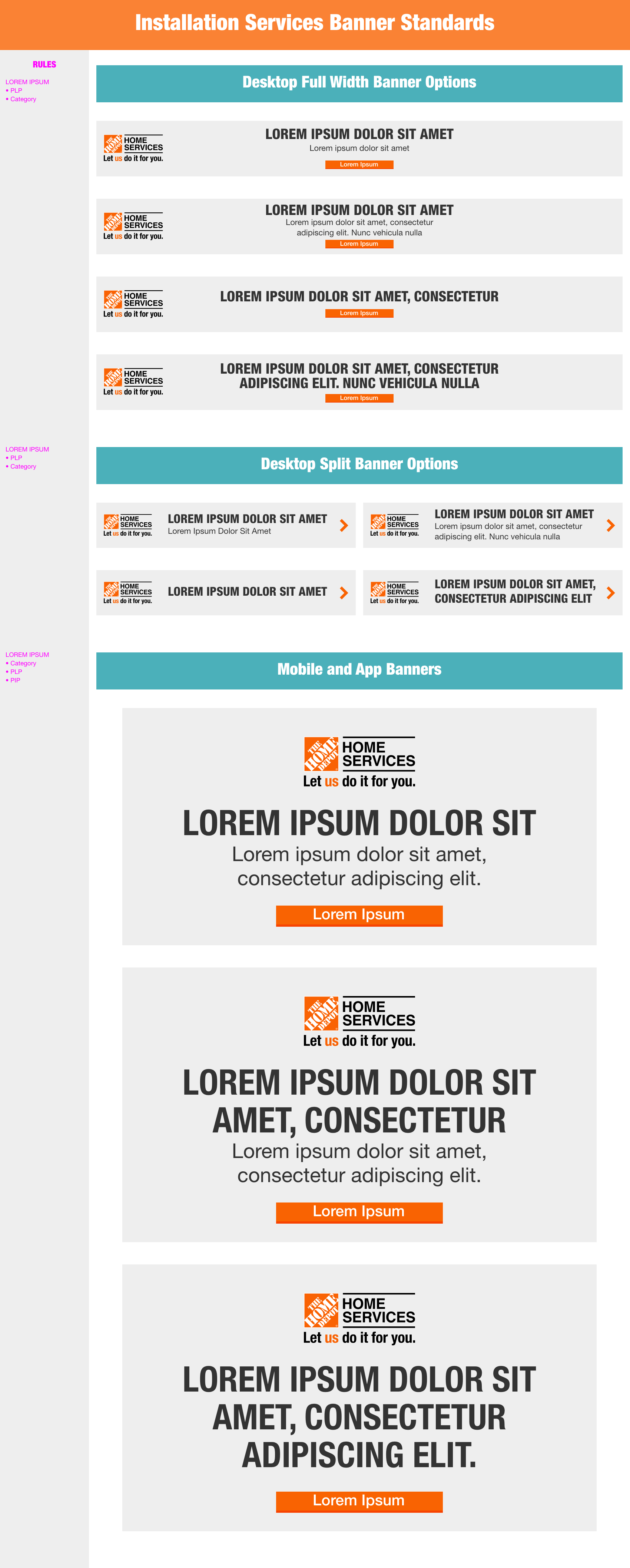
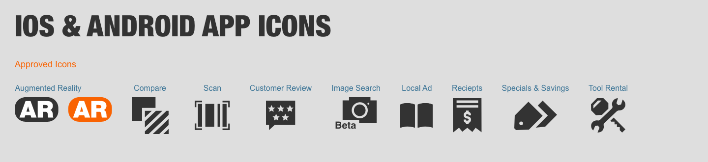
Template Designs:
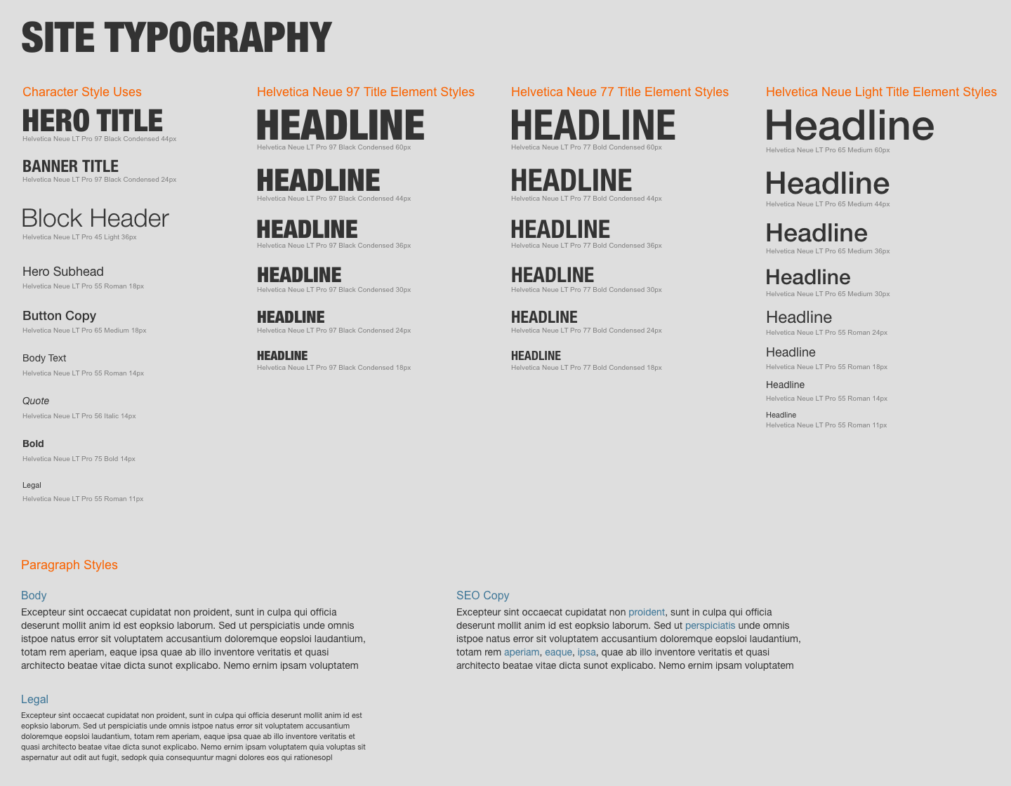
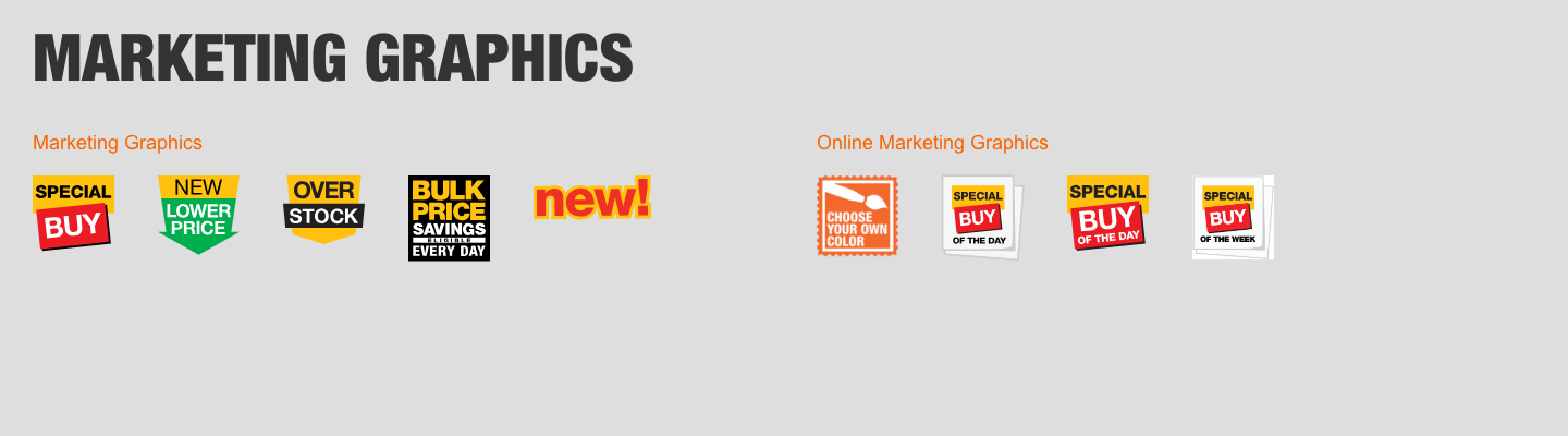
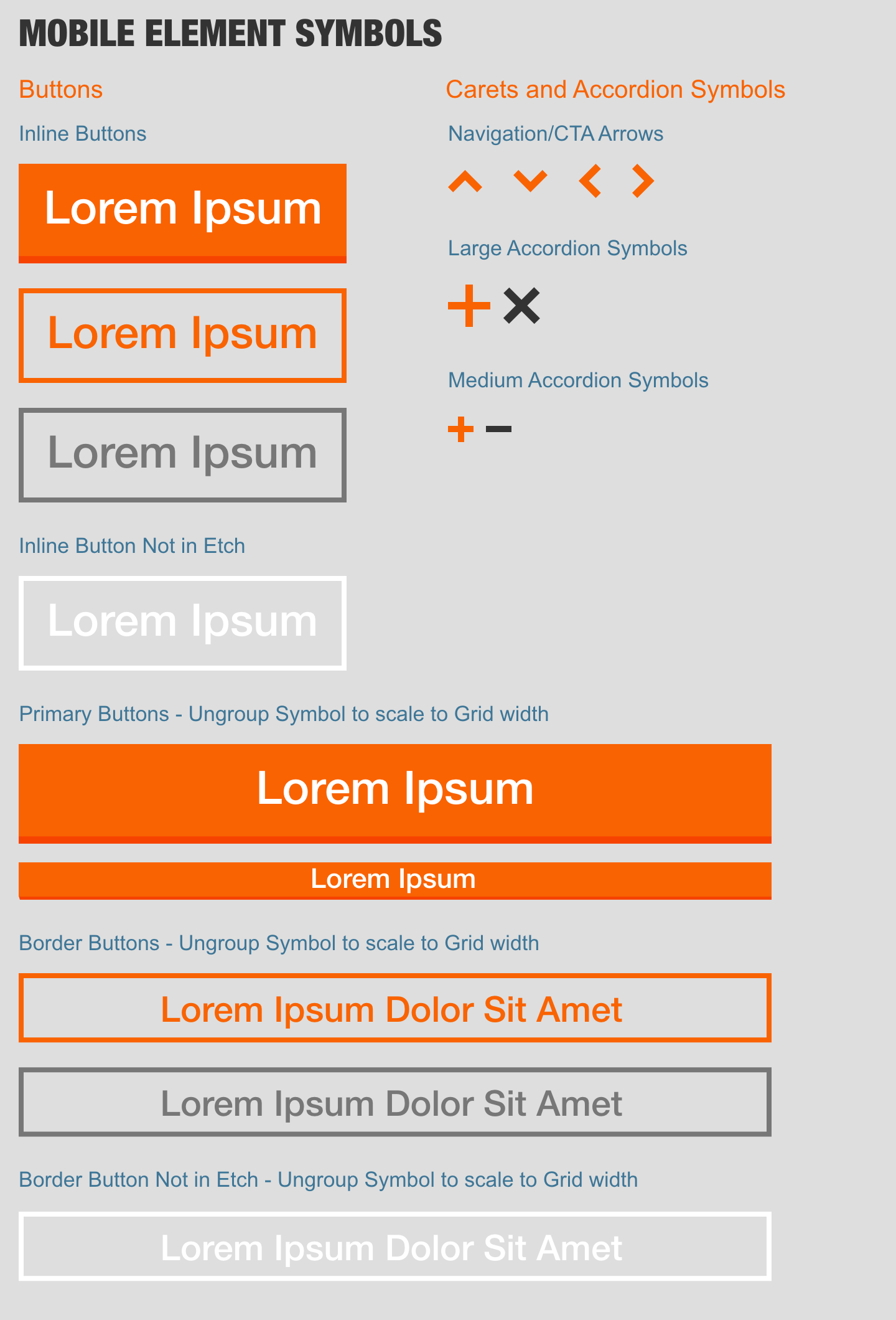
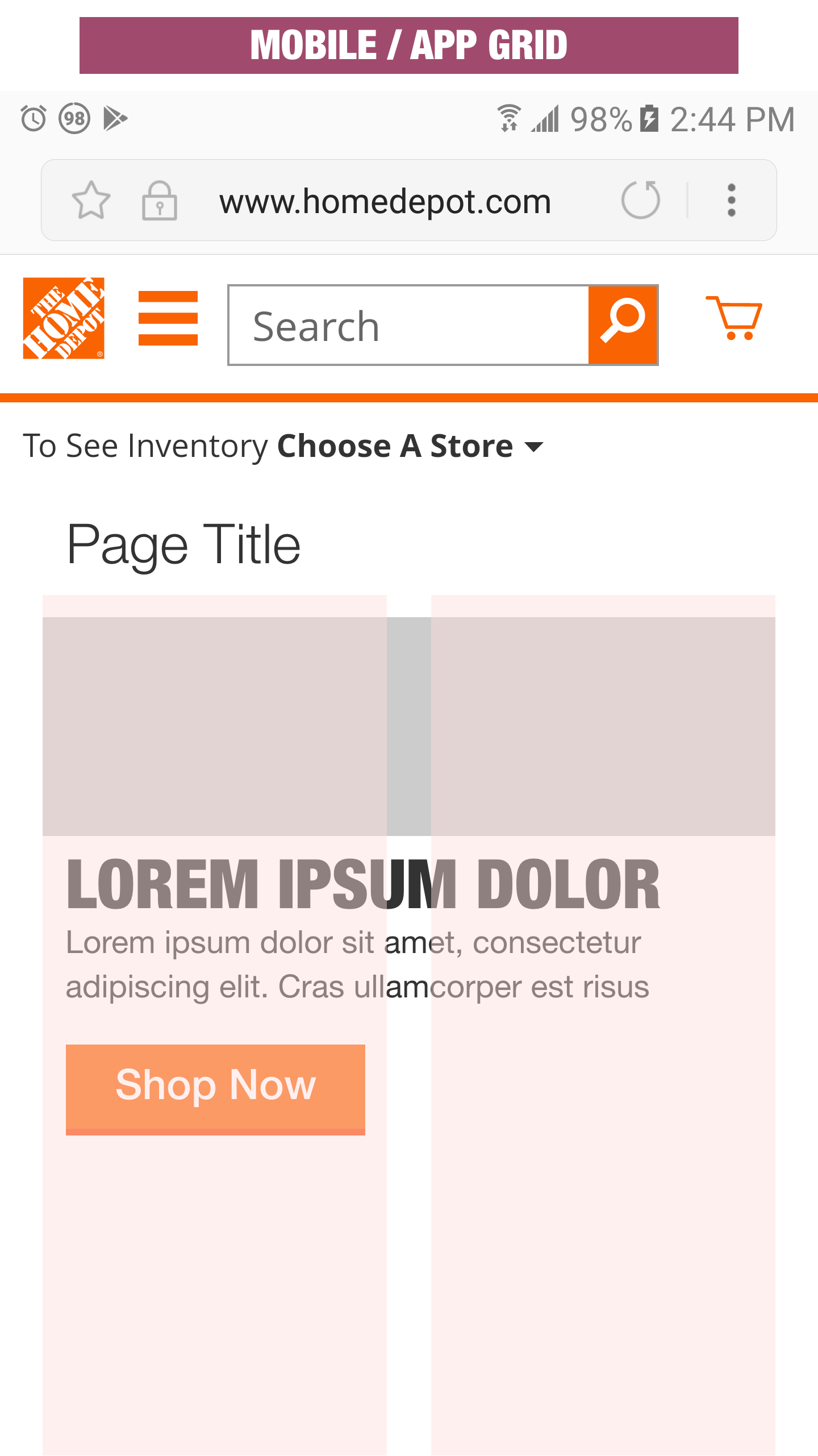
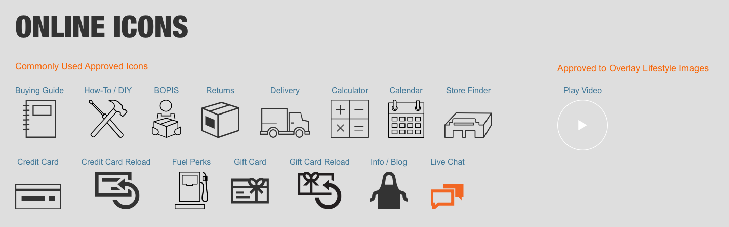
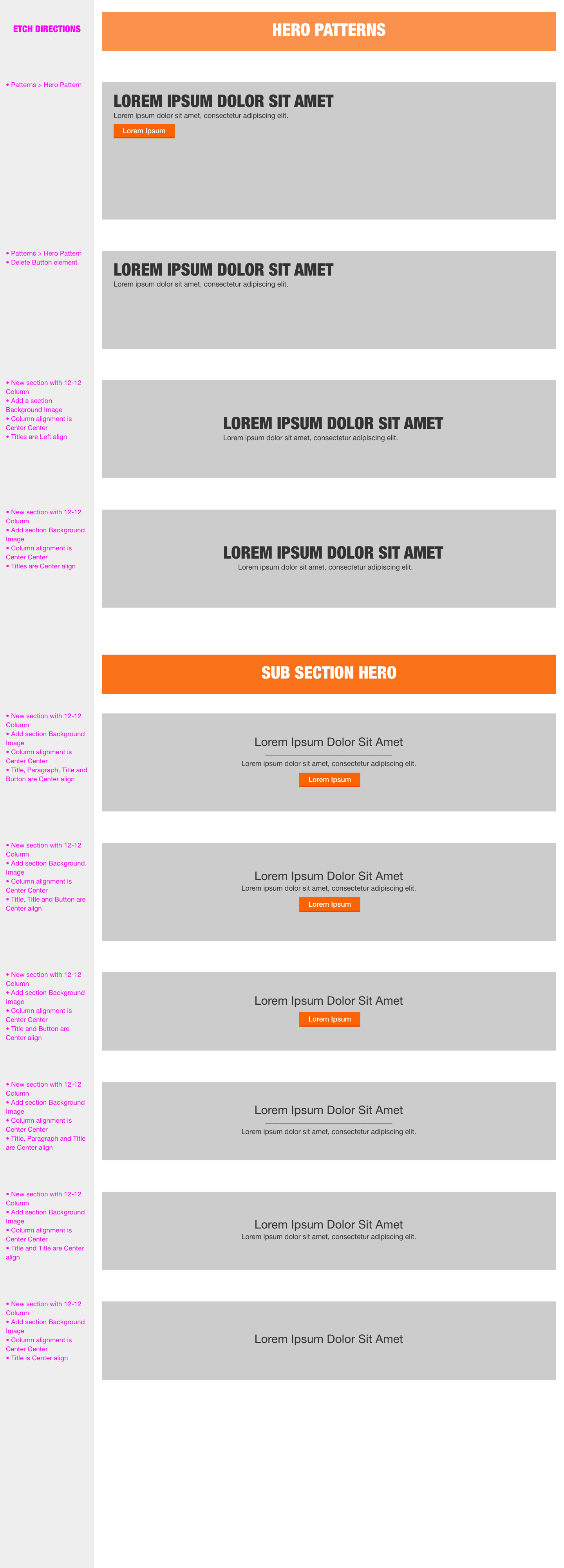
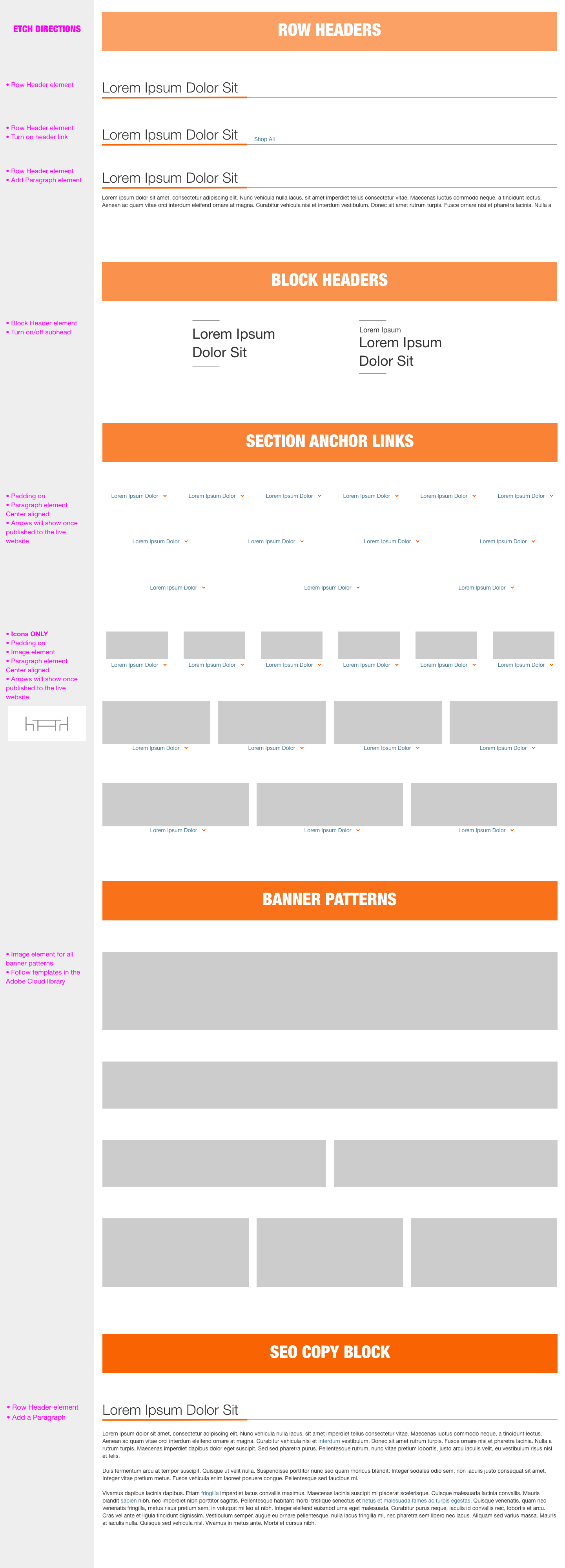
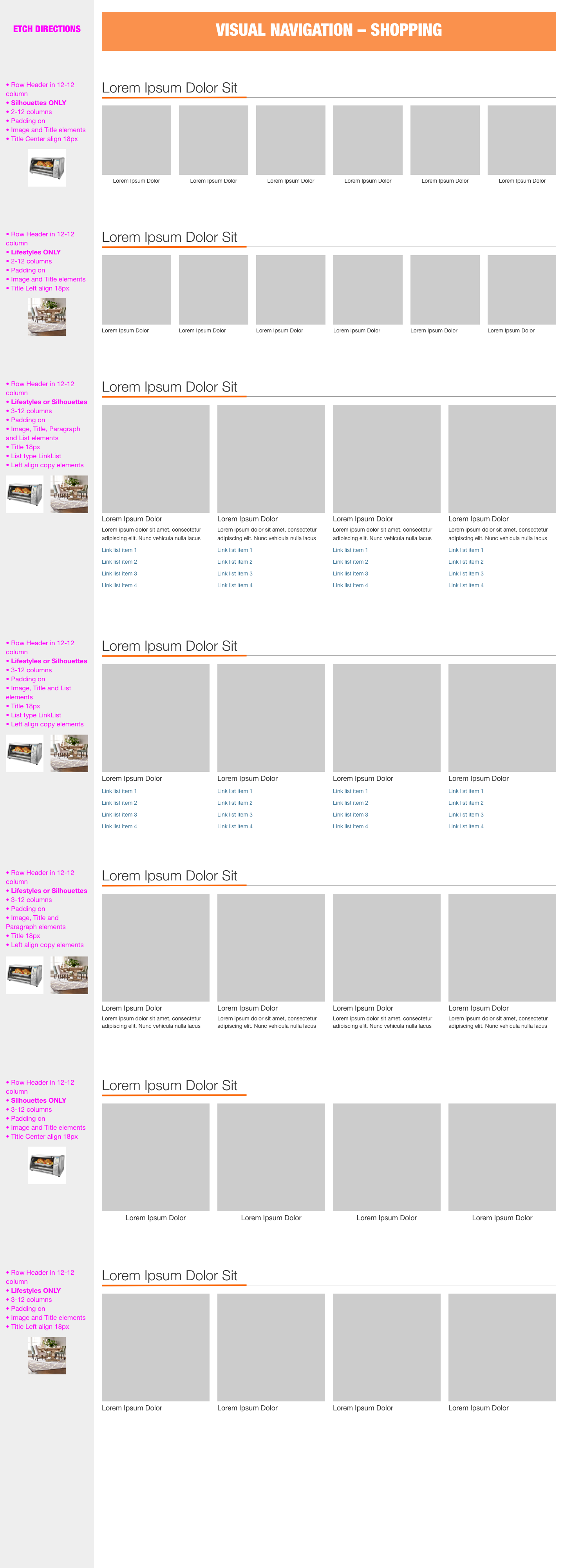
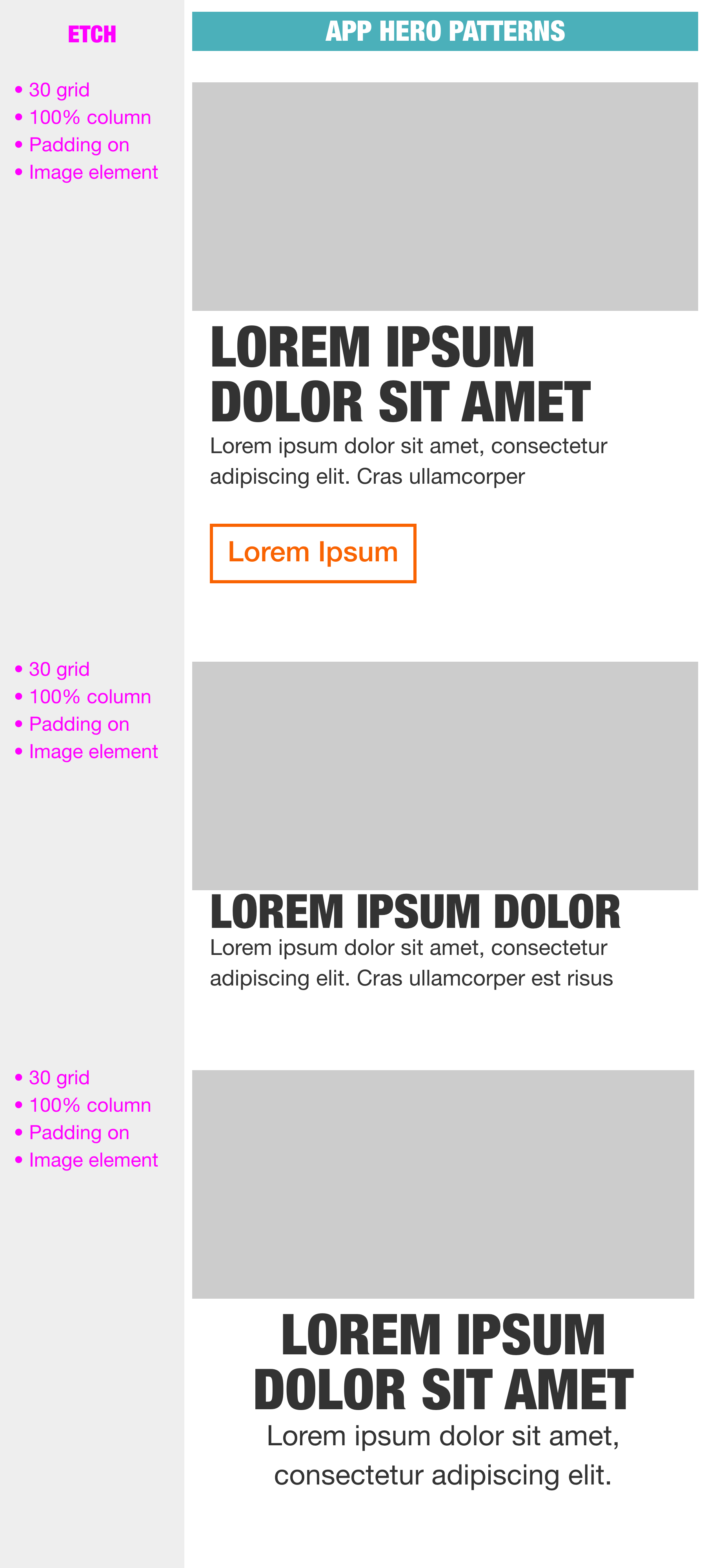
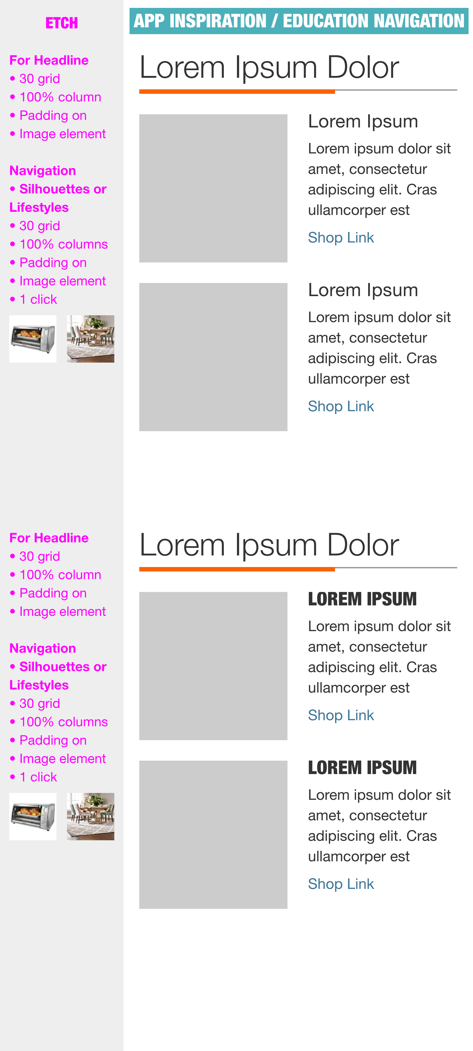
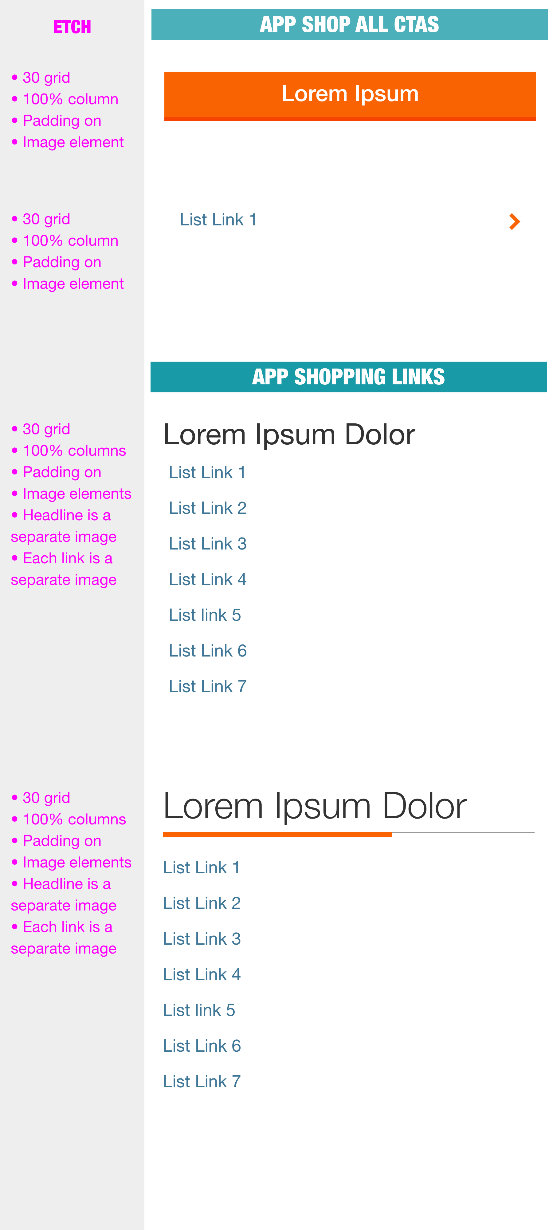
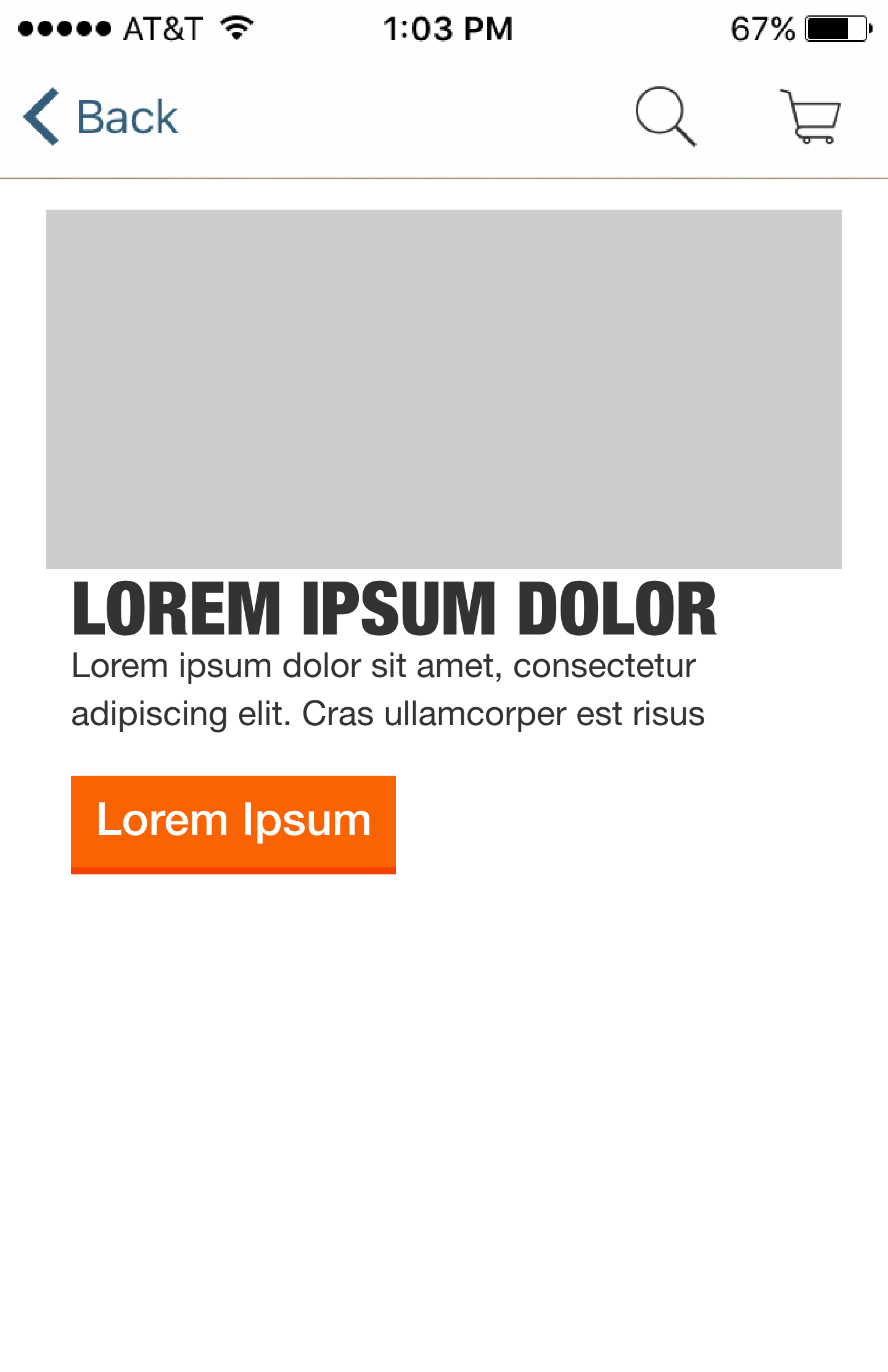
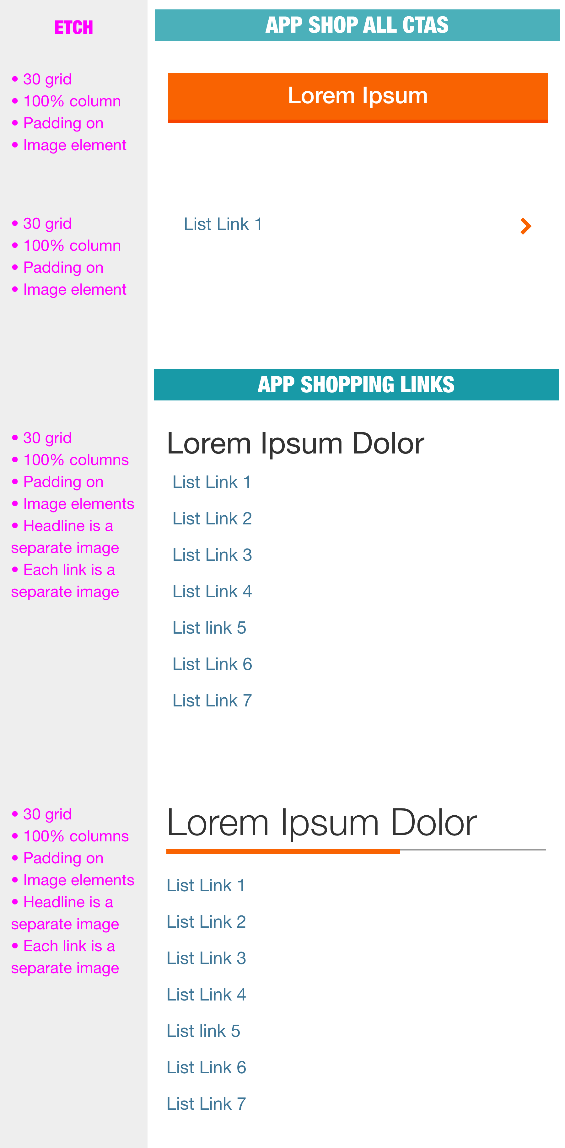
Standardization requires the development of an extensive “kit of parts” for all in the organization to be able to access and use in their designs. This Visual Design Standardization required a huge team effort which I was a contributing member for. There were many iterations and all levels of internal customers that weighed in and gave valuable input to the final selections. Each Carousel below has a representation of each category of these parts which we developed. Adopting these templates has improved our productivity and customer expectations and orientation on our site which has translated into record on-line sales.
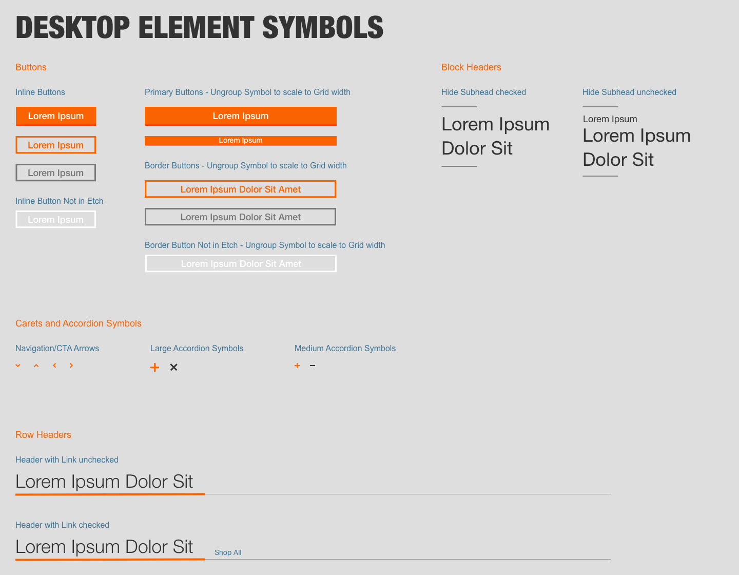
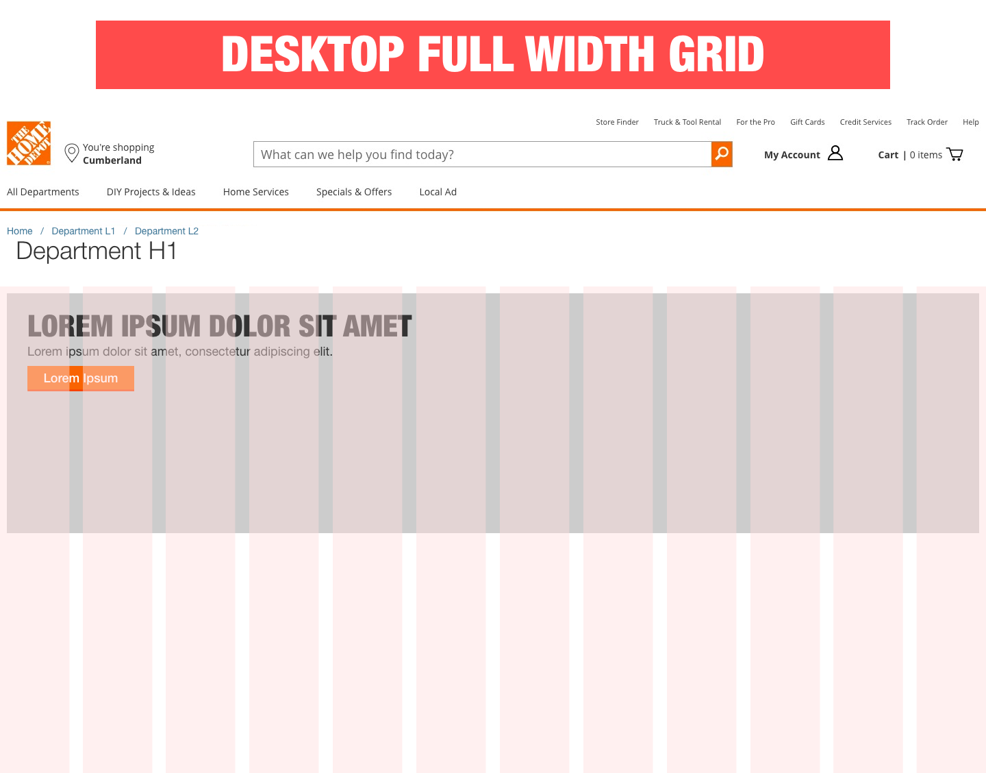
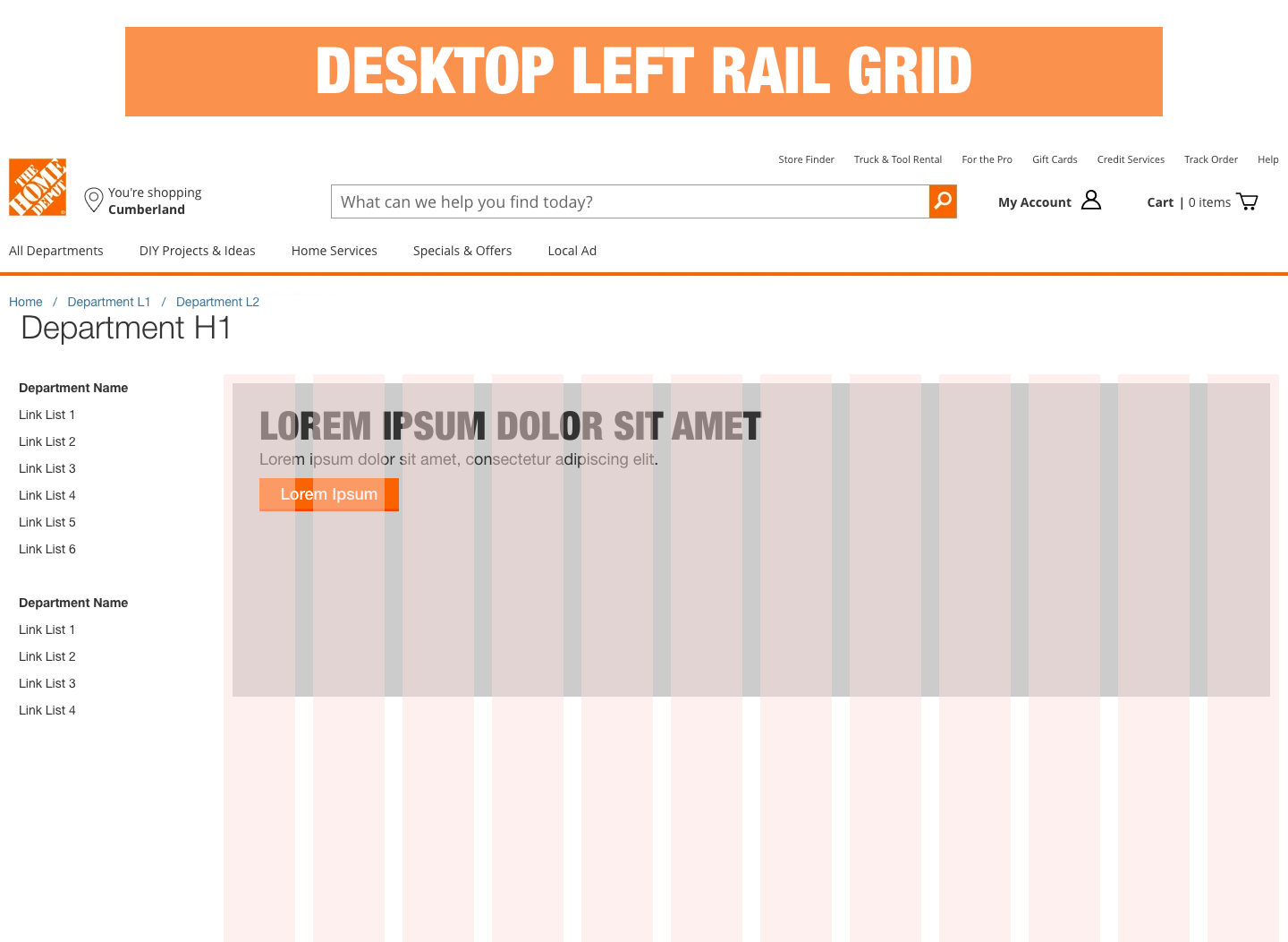
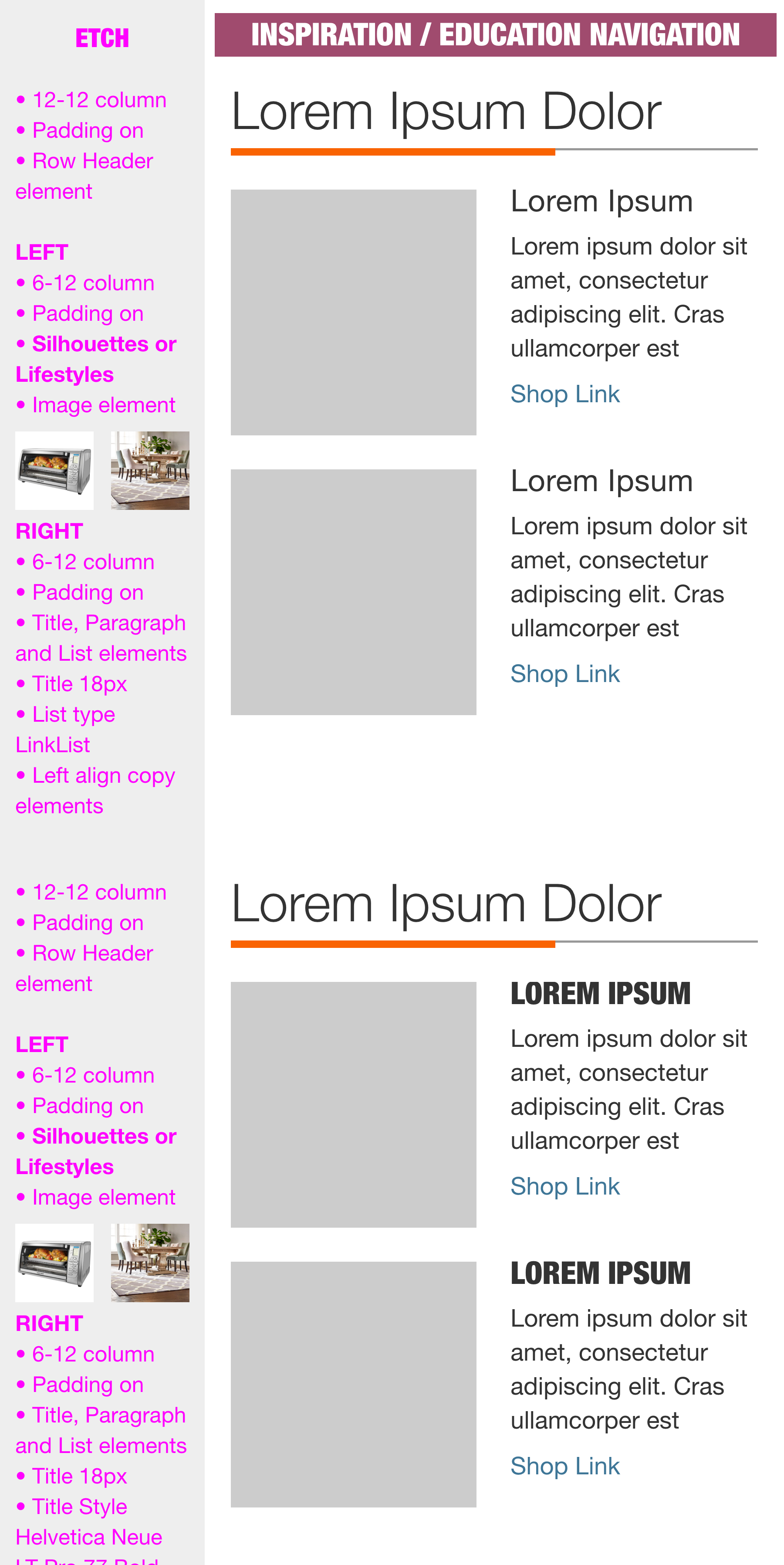
Desktop Design Patterns
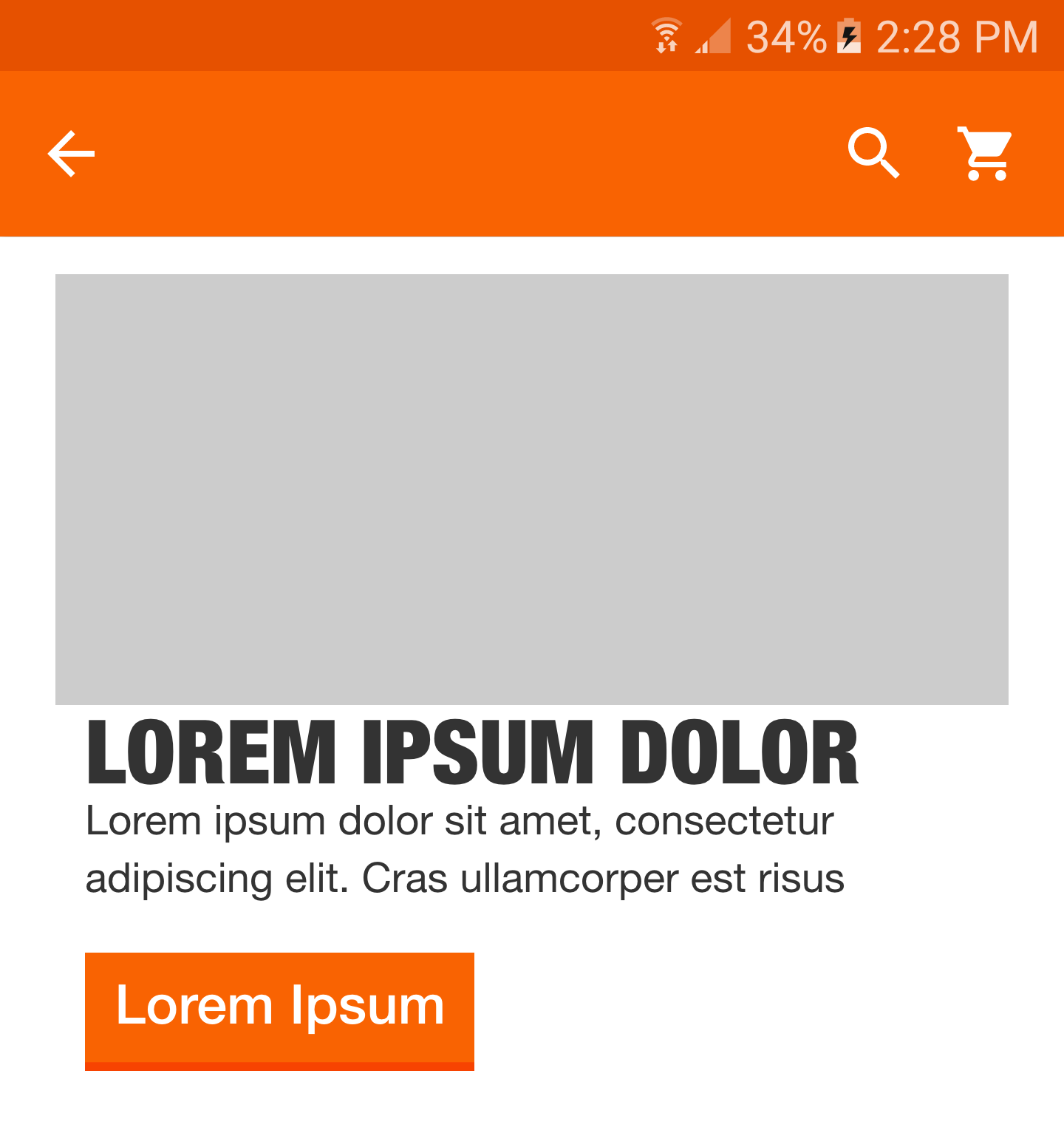
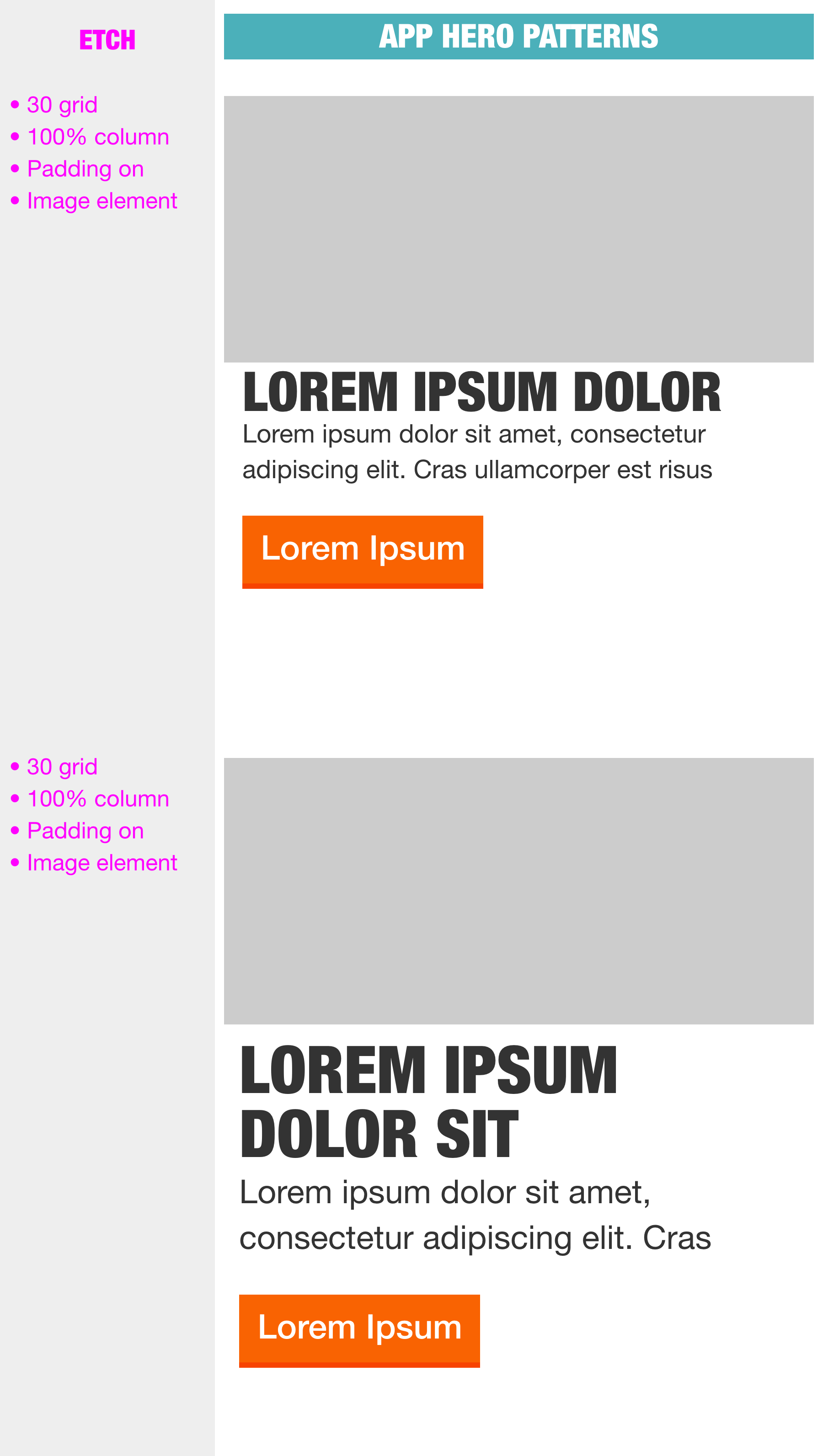
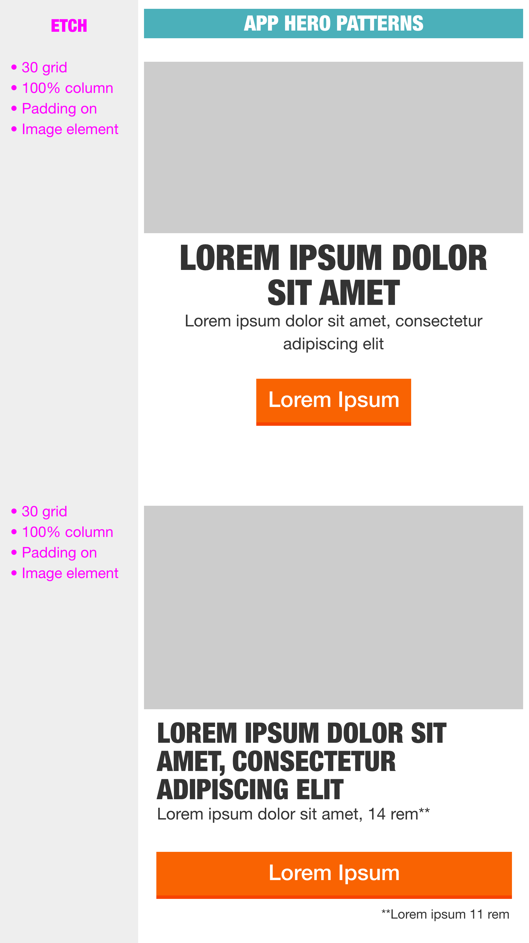
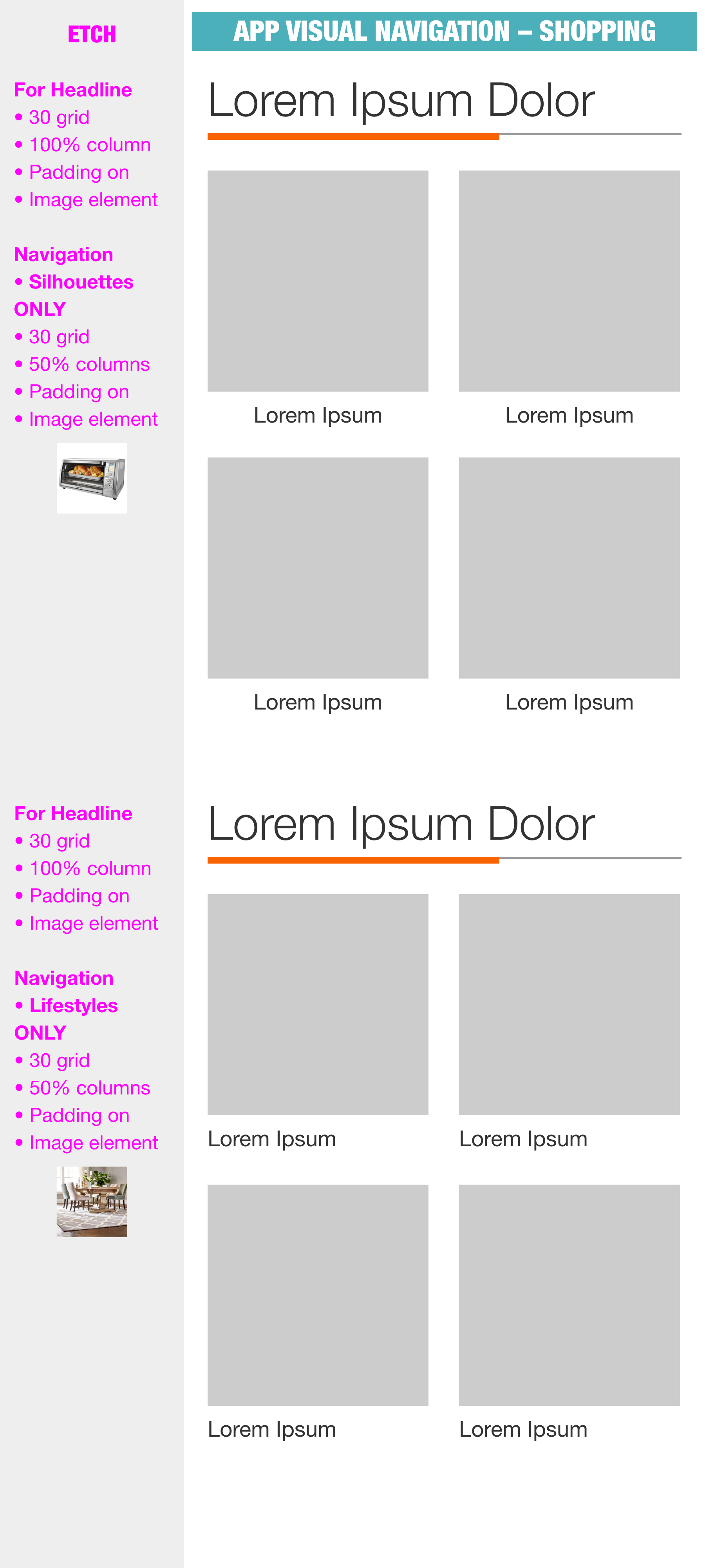
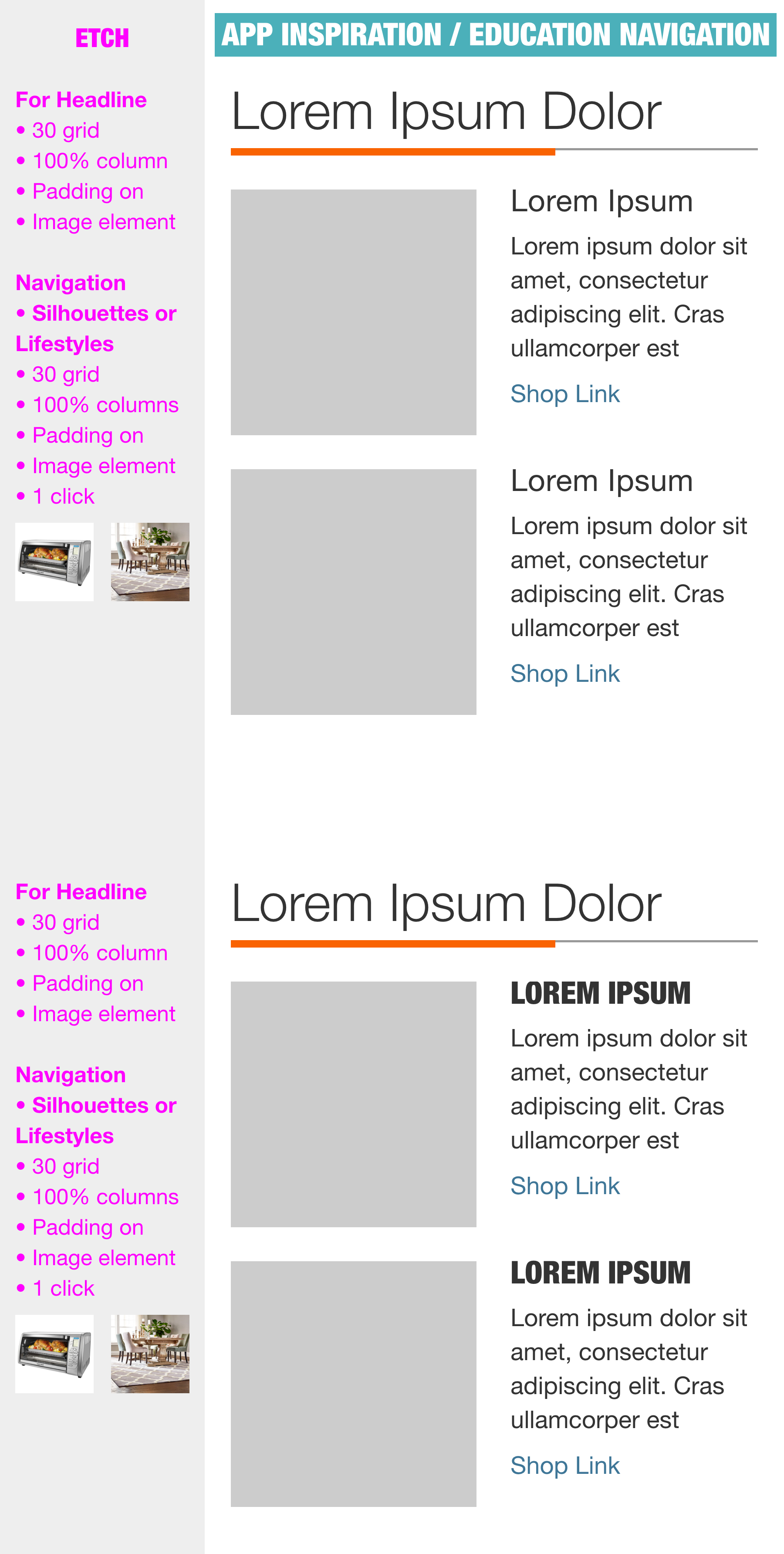
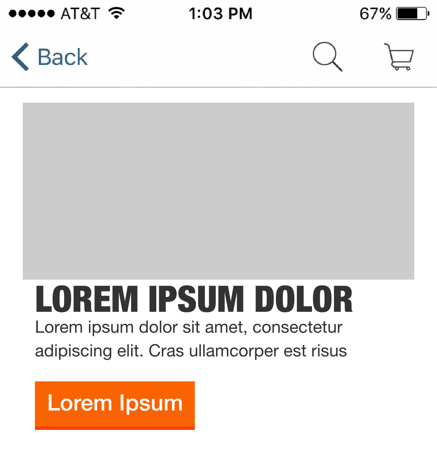
APP Patterns:

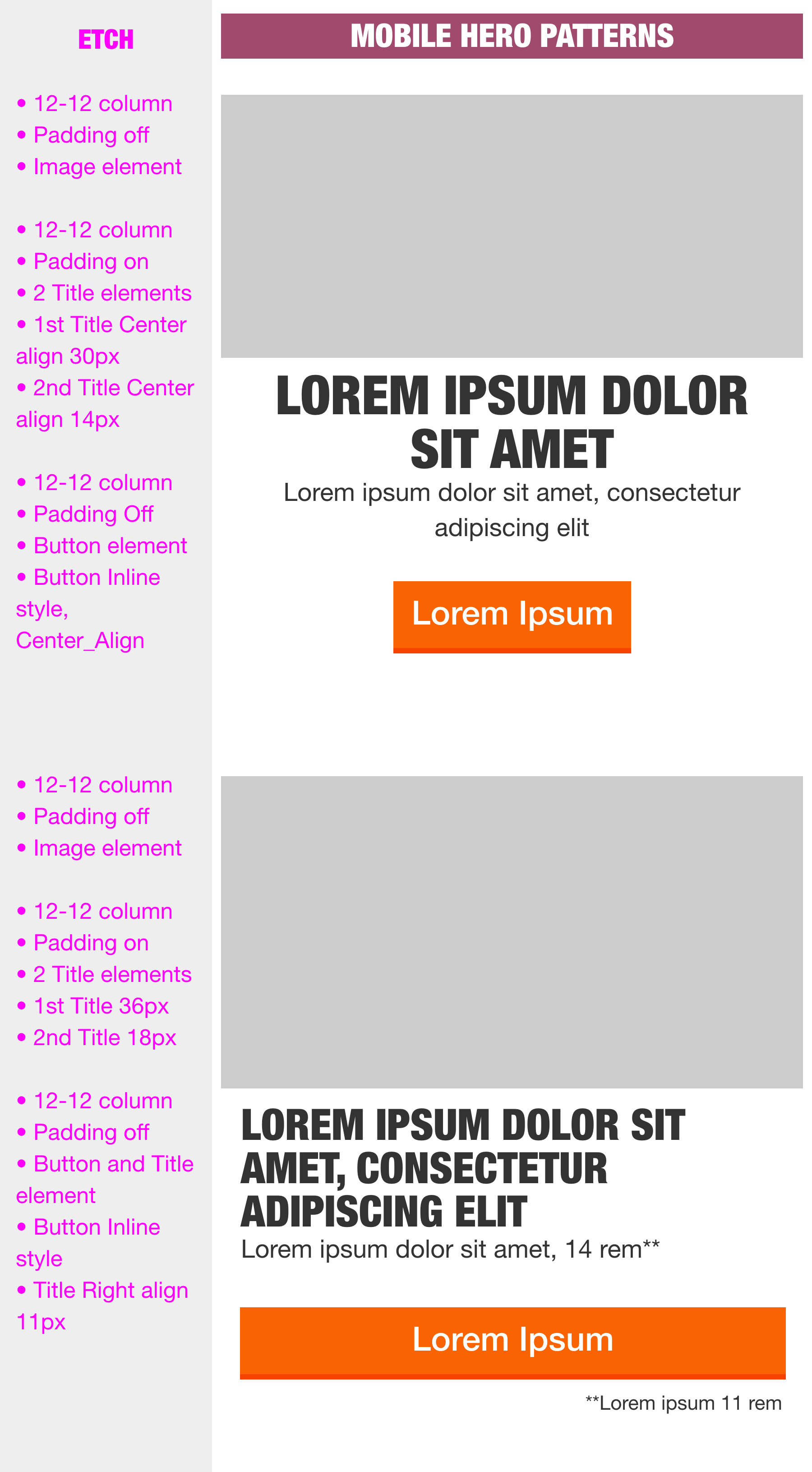
Mobile Patterns:
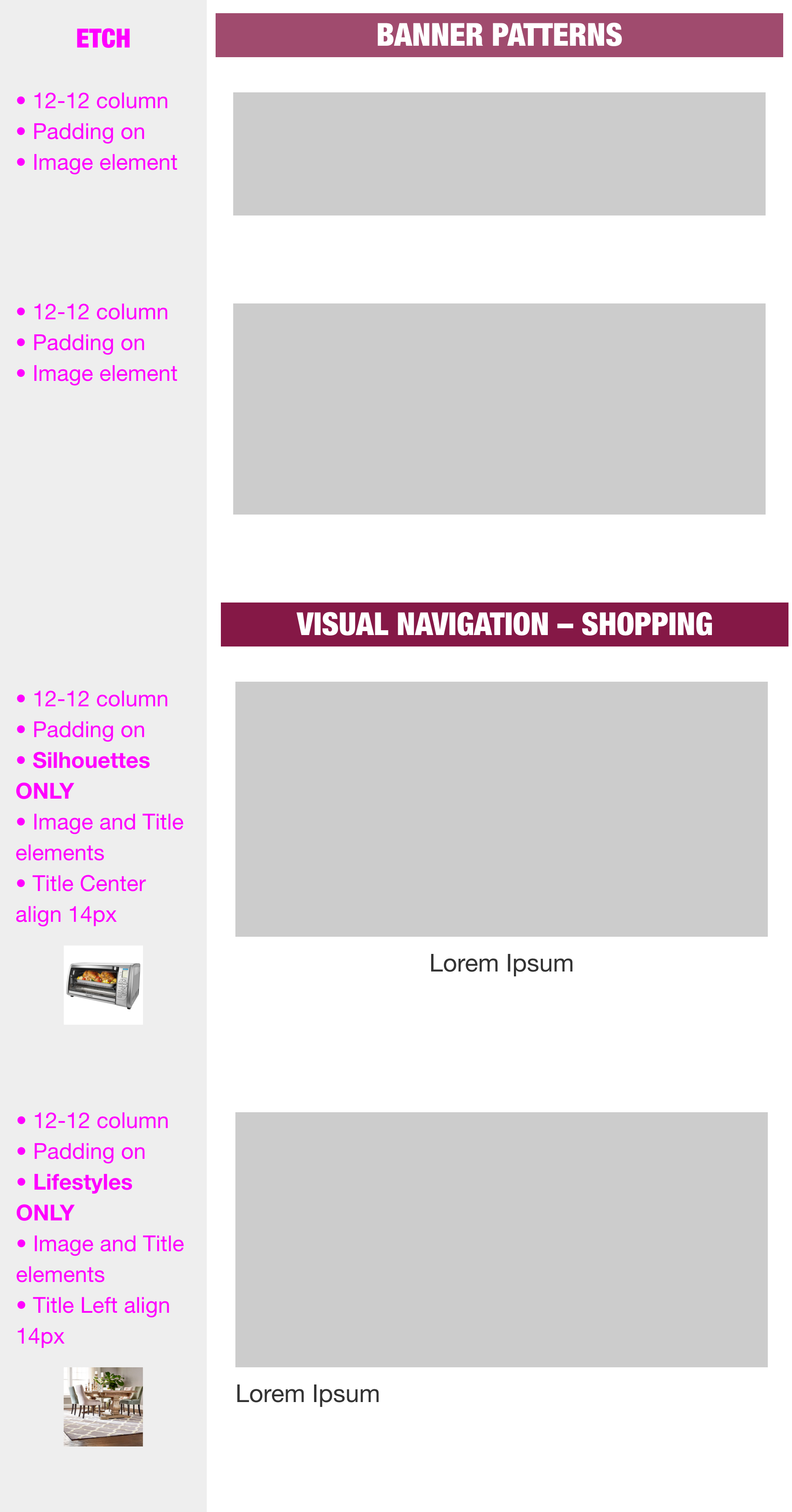

Responsive Banner Templates: