
“The mobile-first, cloud-first is a very rich canvas for innovation - it is not the device that is mobile, it is the person that is mobile.”
My Project:
I was solely charged with designing and converting over 800 DIY pages to a fully responsive design - the first pages of their kind for The Home Depot website! I worked closely with The Editorial Team and the Developers to achieve the look and functionality of these pages. We had several growing pains but ultimately my proactive communication resulted in a successful endeavour. Here are just a few examples:
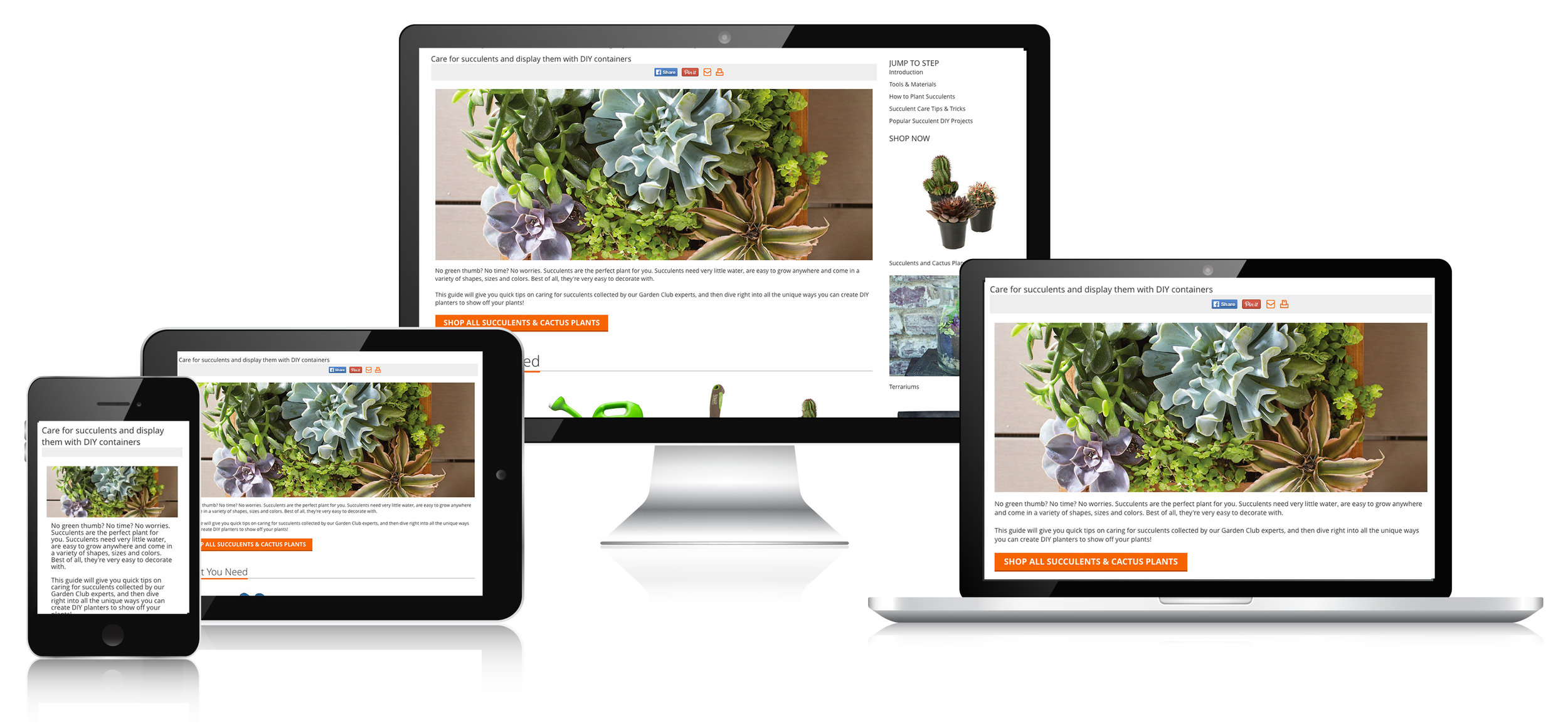
DIY HaNGING SUCCULENT GARDEN
Fully responsive page for Desktop, Tablet and Mobile. Created all imagery and page layouts using Photoshop CC and CMS.

DIY Rose Pruning
Fully responsive page for Desktop, Tablet and Mobile. Created all imagery and page layouts using Photoshop CC and CMS

DIY Spiral Garden
Fully responsive page for Desktop, Tablet and Mobile. Created all imagery and page layouts using Photoshop CC and CMS.
More Mobile
Assignment:
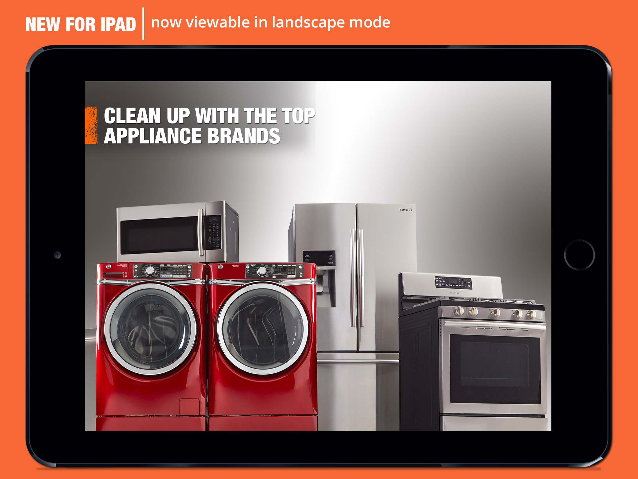
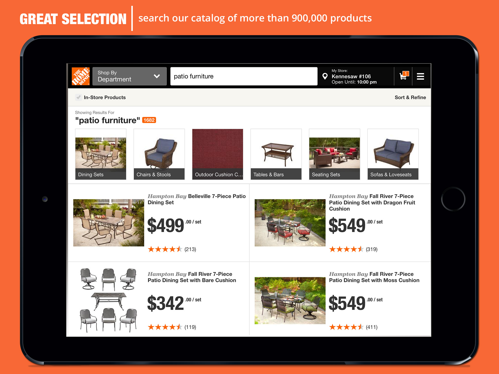
Design the imagery for the App Store for both our mobile and tablet apps. I created all of thew imagery and after several textured and non-textured versions the Management selected The Home Depot Orange background for impact and clarity. Photoshopping actual images of our app landing pages into the device images created a clear and quick scalability of the function offered in our apps.

Tablet & App Designs


mobile banners
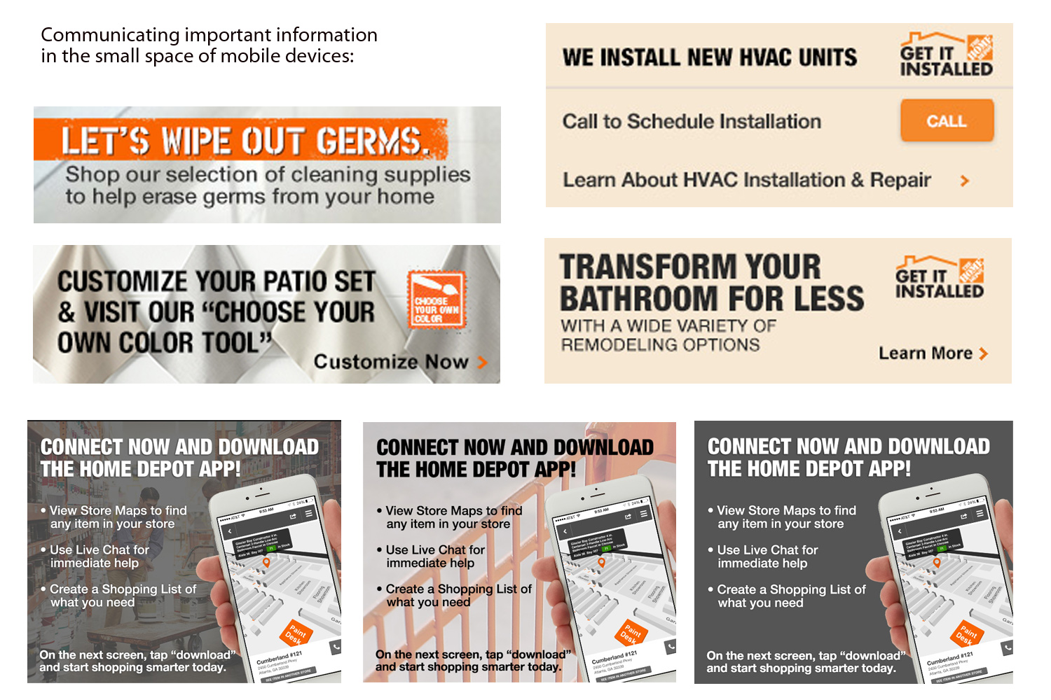
I have designed many impactful banners for both desktop and mobile. I believe that designing in a small space is the true test of effective design and communication. I subscribe to the idea of “embracing the box” in design. Thinking outside the box is easy - innovative design inside a small box is the real challenge.